Client:
My Coach
Timeline:
Three Months
Role:
UIUX Designer
About My Coach
My Coach Online is a platform designed to simplify connections between clients and coaches. Its website serves as a hub for booking, modifying, and tracking coaching services, all while enabling clear communication. With a focus on user-friendliness and transparency, the platform helps users efficiently manage their coaching sessions, enhancing productivity and satisfaction.
Scope
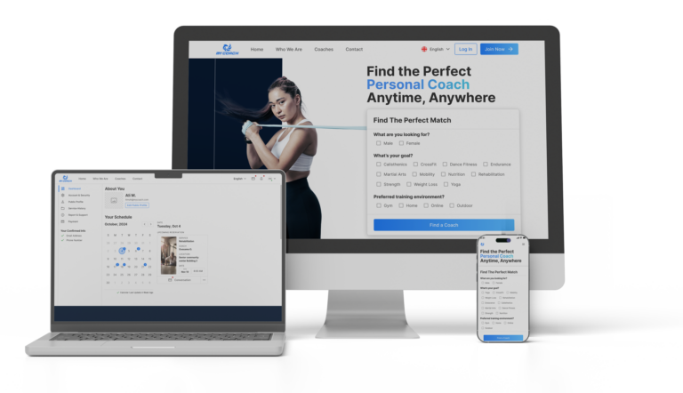
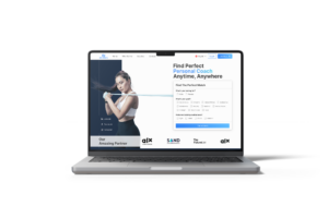
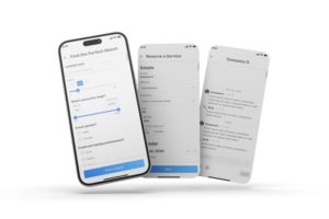
The client need to redesign their landing page with a modern look. Full redesign of the website and dashboard, involving user research, design, iteration, and close collaboration with the founders.
Problem Statement
The original website lacked a modern design and user-friendly interface, resulting in a suboptimal experience for users. Before I joined, the dashboard was not built yet, and I was hired to design and develop it from scratch.
Previous
After
Goals
- Create a modern and intuitive website that reflects the company’s values and mission.
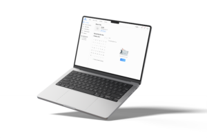
- Design a streamlined dashboard to improve functionality and enhance user productivity.
- Ensure alignment with the founders’ vision and user needs.

My biggest challenge
Optimizing User Flows for Service Transactions
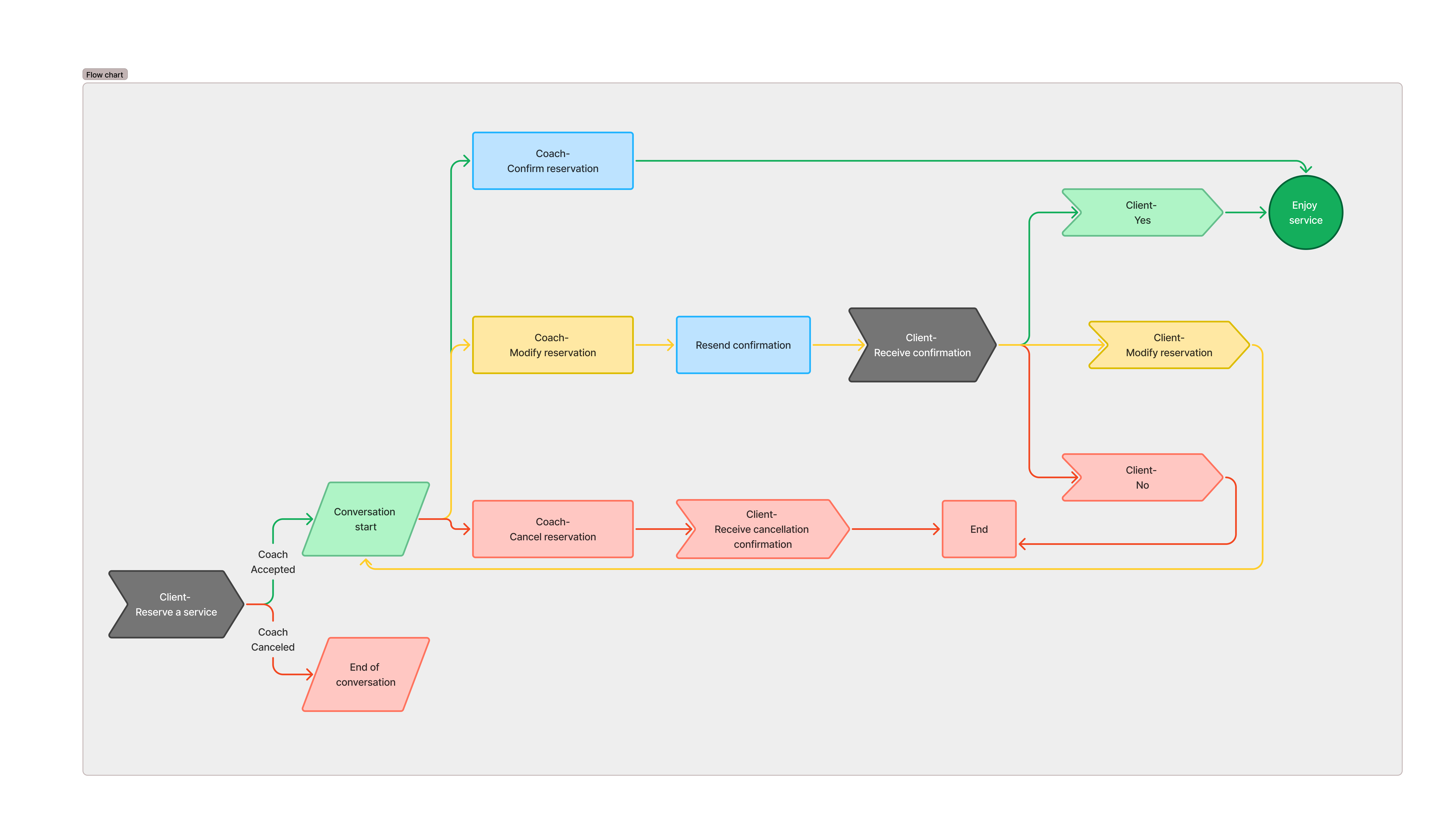
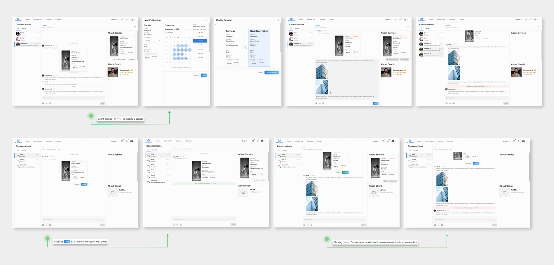
One of the core challenges in this redesign project was enhancing the user experience for key service interactions: reserving a service, cancelling a service, and modifying a service. These features were critical for both clients and coaches, as seamless and intuitive interactions directly impacted user satisfaction and business efficiency.
My Approach
1. Discovery & Research
- Conducted stakeholder interviews to understand business goals and constraints.
- Performed user research, including surveys and usability tests on the original website and dashboard, to identify pain points.
- Analyzed competitors to identify industry trends and best practices.
2. Ideation & Wireframing
- Sketched low-fidelity wireframes to explore layout ideas.
- Collaborated with the founders to align on the direction for the redesign.

Feel struggle with My first approach
Obstacle
While designing the dashboard, I initially separated Messages and Booking/Accepting Services into two different sections. This approach made the user flow feel disconnected, and I found myself struggling to proceed with a cohesive design.
Find Different Approach
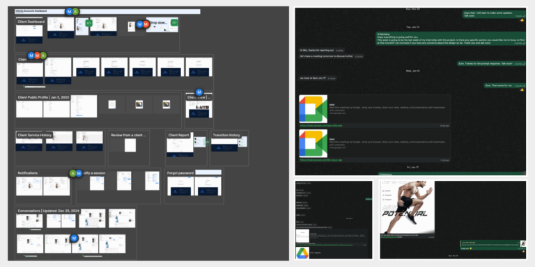
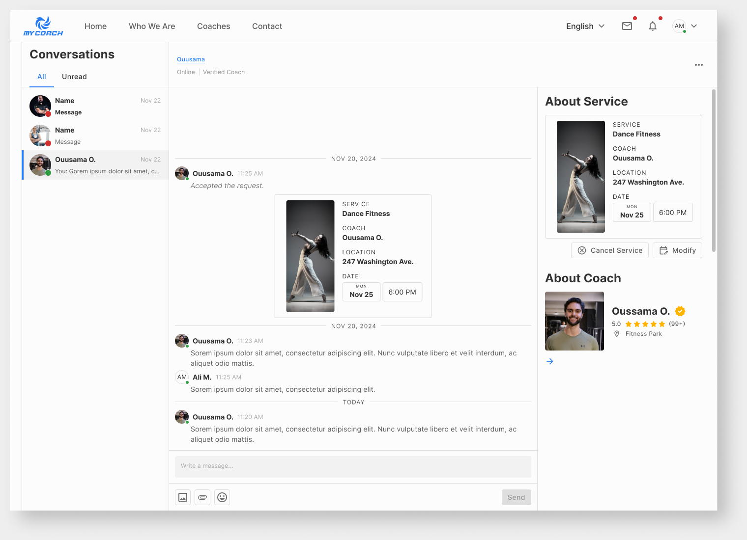
To overcome this, I took a step back and revisited the problem by conducting additional research, recreating user flow and studying references from similar platforms. Through this process, I realized that combining Messages and Booking/Accepting Services into a single conversation interface could create a seamless and intuitive user experience.
Outcome
By integrating these actions into one conversation flow between coaches and clients, users could now manage transactions—such as reserving, modifying, or canceling services—directly within their chats. This not only streamlined the design but also aligned with the business goal of simplifying interactions.
Results
Founder Feedback
The founders expressed great satisfaction with the design, highlighting how it aligned with their vision and enhanced usability for clients and coaches.
Streamlined Experience
The new integrated design simplified service transactions, making the platform intuitive and efficient.
Professional Growth
This project gave me valuable experience in building a comprehensive Design System from scratch, ensuring consistency across the platform. Additionally, I collaborated closely with engineers to effectively hand off designs and streamline implementation.
Takeaways
- Importance of aligning design decisions with user needs and business goals.
- Value of iterative feedback in delivering a polished product.
- Most importantly, I got a great opportunity to learn and provided my expertise to help others achieve their goals!
